This type assignment initiates the ‘fat fold’ project. An imaginary character is built from scratch and then three dimensionalized. The san serif Foro Sans typeface is used to reflect it simple modernity. Foro Sans is a new version of the hairline-serifed Foro family (Foro and Foro Rounded). It contains the same number of styles, and its form features similar characteristics.
Letters from the Foro family are analyzed to ensure the prominent features existing in the family transitions smoothly over to the new type created. The first letter created combines the loop of ‘g’ and the tail of ‘j’, pronounced ‘guh’. The centrally aligned axis of the bowl and loop of ‘g’ is kept and brought up to the baseline. The loop segment is then connected with the tail segment of ‘j’, which remains its position in between the mean and the descender. A shoulder is then added as a connector for the two segments, resulting in a slightly bent top of what was the tail of ‘j’.
![]()
Constructed letter 'Guh'
For the second letter a more linear form is desired to contrast the rounded form of ‘guh’. Letters ‘i’, ‘j’, ‘t’ and ‘f’ were studied as they are all major stem-based characters and share a certain verticality. The letter ‘fft’ is created with distinctive features of letters ‘f’ and ‘t’ in the family. The hook of ‘f’ is reflected and right arm kept but lowered to just above the center line between the mean and baseline. The tapering arm from ‘t’ remains exactly where it was and so does its slightly extended tail. This letter contains two arms yet they both vary in length and height, creating a subtle dichotomy along its center stem.
![]() Constructed letter 'Fft'
Constructed letter 'Fft'
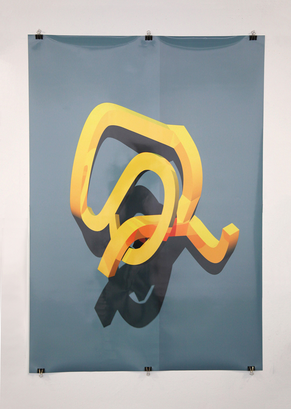
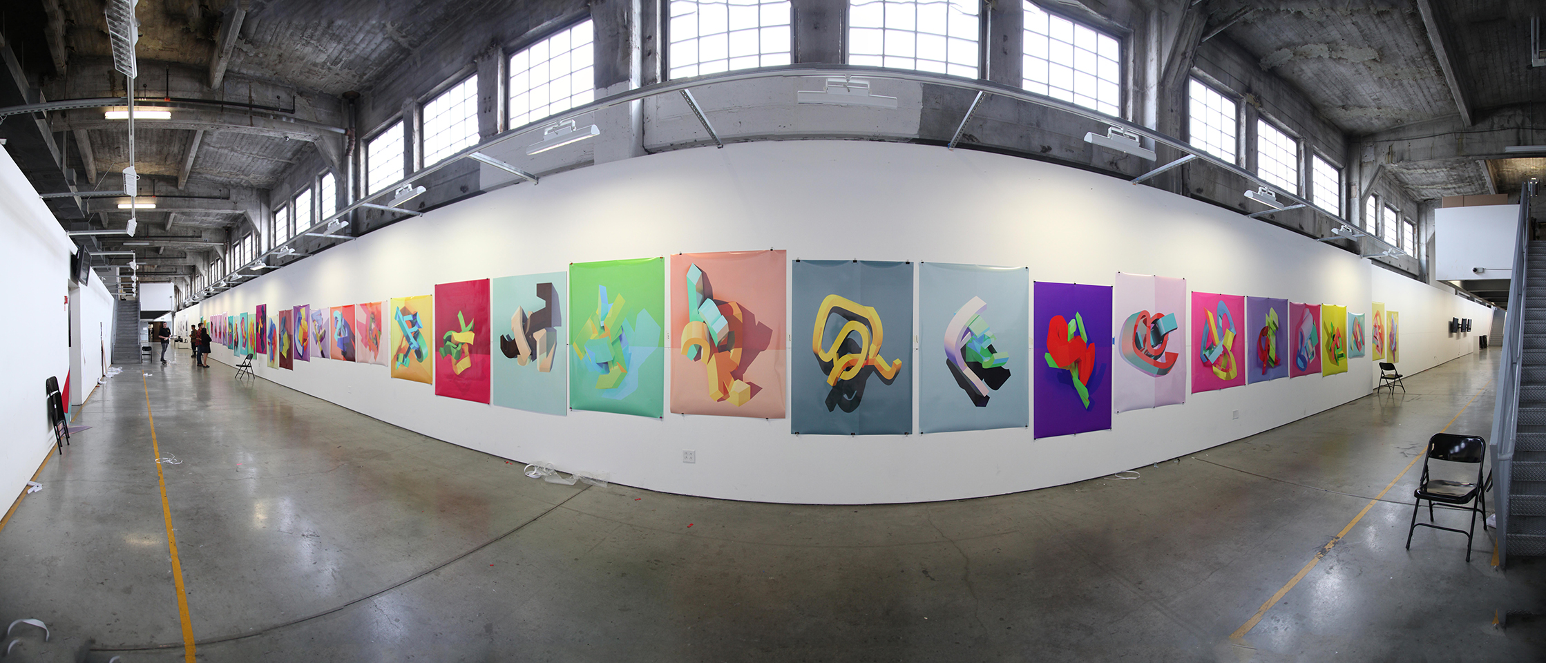
“Letters created are three-dimensionalized to create a monogram-like artpiece. The type is given depth, then literally twisted and deformed until it produced an enticing, almost erotic form to contrast its clean, regulated two-dimensional self.”
Letters from the Foro family are analyzed to ensure the prominent features existing in the family transitions smoothly over to the new type created. The first letter created combines the loop of ‘g’ and the tail of ‘j’, pronounced ‘guh’. The centrally aligned axis of the bowl and loop of ‘g’ is kept and brought up to the baseline. The loop segment is then connected with the tail segment of ‘j’, which remains its position in between the mean and the descender. A shoulder is then added as a connector for the two segments, resulting in a slightly bent top of what was the tail of ‘j’.
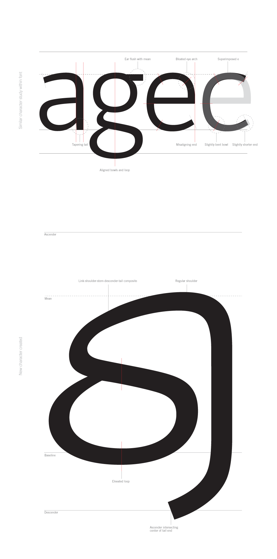
Constructed letter 'Guh'
For the second letter a more linear form is desired to contrast the rounded form of ‘guh’. Letters ‘i’, ‘j’, ‘t’ and ‘f’ were studied as they are all major stem-based characters and share a certain verticality. The letter ‘fft’ is created with distinctive features of letters ‘f’ and ‘t’ in the family. The hook of ‘f’ is reflected and right arm kept but lowered to just above the center line between the mean and baseline. The tapering arm from ‘t’ remains exactly where it was and so does its slightly extended tail. This letter contains two arms yet they both vary in length and height, creating a subtle dichotomy along its center stem.
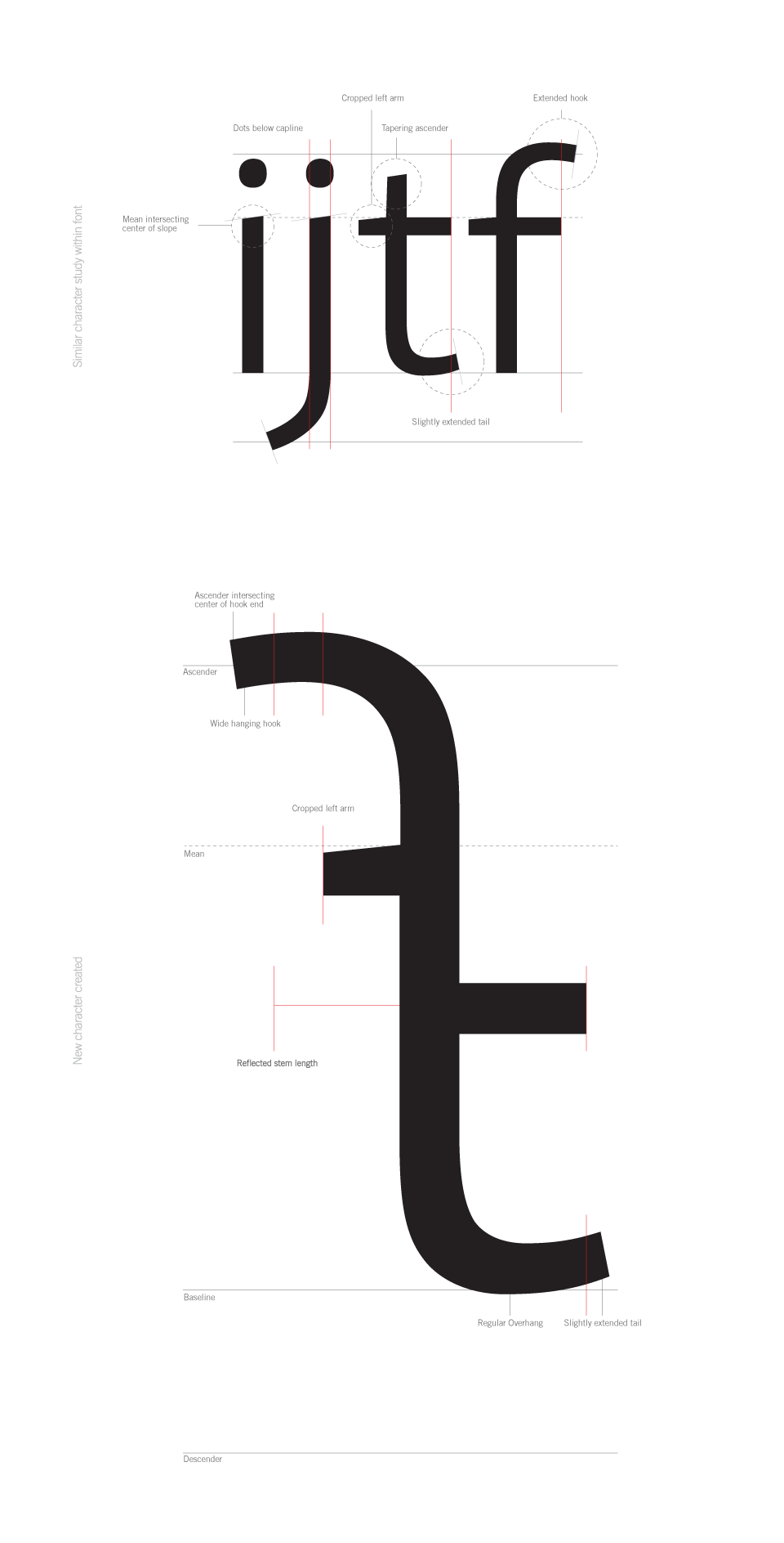 Constructed letter 'Fft'
“Letters created are three-dimensionalized to create a monogram-like artpiece. The type is given depth, then literally twisted and deformed until it produced an enticing, almost erotic form to contrast its clean, regulated two-dimensional self.”